Partner guidelines
At Flywheel, we have the opportunity to collaborate with a diverse range of partners. To ensure consistent brand identity across different scenarios, we have established some guiding principles. These principles are designed to help our partners understand how to apply our brand in a way that aligns with our values and goals.
Download assetsPrimary mark
The Flywheel logo represents a self-sustaining cycle driving growth and evolution. It's decisive, professional and trustworthy just like our ongoing leadership in the digital commerce space. For most applications, use the full logo mark.
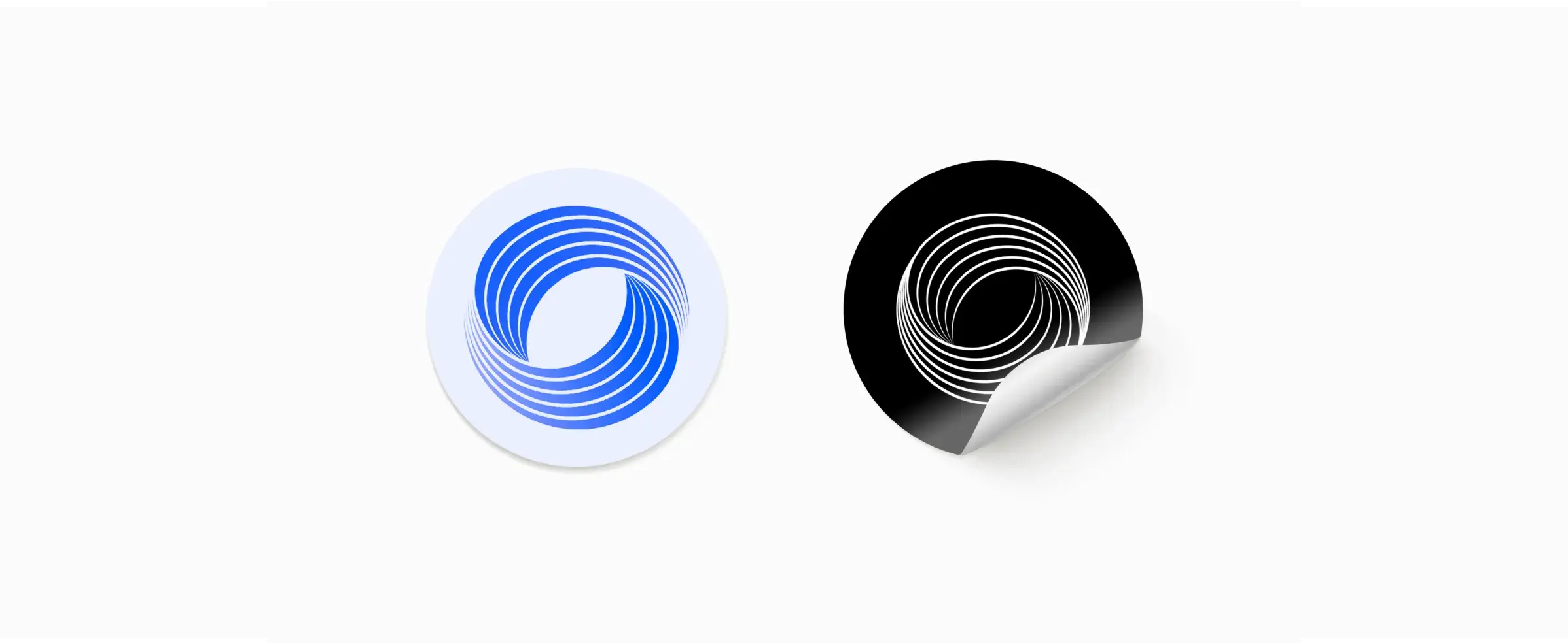
Flywheel mark
The Flywheel Mark should be used sparingly on its own as we build recognition. Application examples include smaller spaces, and selectively in graphic assets.


Logo + partner lockups
Some partnerships may be approved for the creation of a Flywheel-partner logo lock-up. Ensure that the Flywheel logo appears first, there is a complete parity of size, placement and prominence in the partner materials, and that there is appropriate spacing between the logos per the Flywheel clear space guidelines.
Partner logos should be scaled appropriately next to the Flywheel logo, and should have the same height so that they both look balanced.
If a Partner is using their symbol, the Flywheel symbol should be used. If a partner is using their full logo, use the full Flywheel wordmark.
We have provided a few examples of different layouts below to showcase this flexibility.


Special use
Prelude Blue & White are our brand's signature colors, but our logo does appear in greyscale when necessary. DO NOT USE without approval from the Brand Team.


Space & scale
We never crowd our logos. We give them space to breathe and stand out. They are an appropriate scale related to the content or bounding box around them.
The clear space around the the Flywheel Logo is the height of the "e"s in the word mark. No surrounding content should be inside these bounds.


When the logo is the only element in a space, we recommend it is scaled back to occupy approximately 25% of the space, instead of filling the entirety of it.


Things to avoid


Application examples
Legal
This is a friendly legal reminder that these graphics are proprietary and protected under intellectual property laws.